Showing posts with label photoshop tutorial. Show all posts

Monday, September 1, 2008

Photoshop Fluffy Realistic Clouds

Step 1 - Setting up the Document

Create a new image 500x500px with a "transparent" background.

Fill ( Edit > Fill ) the background layer with Black ( Hex #000000 ). On the Color Palette, set the Background color as #3E6CAA and the Foreground color as #76B6F4.

Gradient OverlayRight-click the background layer on the Layer Palette and choose Blending Options.

Apply a Gradient Overlay using the settings shown in the image to the left.

Note: If the colors shown in the Gradient Overlay window are not the blue shown in the screenshot, click on the dropdown in the Gradient Overlay window and choose the first option.


Step 2 - Rendering the Clouds

Create a new layer called "CloudBase". Press D to reset the Color Palette.

Difference CloudsRender some Clouds ( Filter > Render > Clouds ). Next, render Difference Clouds ( Filter > Render > Difference Clouds ) three times. Do this by using the top menu to execute the Difference Clouds filter once, then pressing Ctrl-F 2 times to repeat the last filter (in this case Difference Clouds) two times.


Step 3 - Creating 3 Dimensions

Levels MenuLevels AppliedBring up the Levels Menu ( Ctrl-L or Image > Adjustments > Levels... ). Use around the settings shown in the image to the left.

Duplicate layer "CloudBase" and rename the new layer "Cloud3D".

ExtrudeExtrude ( Filter > Stylize > Extrude ) layer "Clouds3D" with the settings shown to the right.

Blending Mode changed to ScreenGaussian BlurChange the Blending Modes of both layer "Cloud3D" and "CloudBase" to "Screen".

Choose layer "Cloud3D". Apply a Gaussian Blur ( Filter > Blur > Gaussian Blur ) with a power of 1.6.

The clouds are decent at this point but they look a bit flat. To fix this, we must brush on some shadows.


Step 4 - Applying Shadows

Take the Brush Tool and change its settings to what is shown in the image below.

Brush Tool

Make a new layer and name it "Shadows".
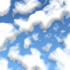
Shadows 1The light will be coming from slightly above. Imagine you are looking up into the sky. The shadows on the clouds are going to be on the bottom of them. just follow the sample if you are confused.

It does not matter at this point if your shadows are sticking out beyond the clouds into the sky.

Step 5 - Cleaning up the Shadows

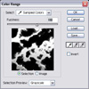
Color RangeNow, open the Color Range window ( Select > Color Range ). Set the Fuzziness to 118. Click on a part you know has no clouds. Click Ok.

You should have a selection where the sky is and a little bit into the clouds. If you are not already on layer "Shadows" go to it. Press Delete. Change layer "Shadows" opacity to 50%.

Shadows 2The clouds are starting to look much more realistic. One more step! If you were looking at clouds from below, the clouds would not be that white. You are going to airbrush a showdown that covers the whole cloud except the edges that are above. It is a little confusing so please look at the images.


Step 6 - Final Shadowing

ShadowingCreate a new layer and name it "Shadows 2". Take out the Brush Tool again and start shadowing the cloud. Be careful not to shadow the top of each cloud. Also, don’t brush a place more than once.

Shadowing FinishedApply a Gaussian Blur ( Filter > Blur > Gaussian Blur ) with a power of 6.5.

You're done! Finito! Terminaste!

Monday, June 23, 2008

create an 80s-style underground gig poster effect

Derek Lea shows you how to combine Photoshop with ‘traditioinal’ technology to create an 80s-style underground gig poster effect.

When it comes to editing images for use in websites, more often than not, we’re trying to achieve perfection within Photoshop. But every once in a while, a task comes along that demands something different.

In this tutorial, we’re going to show you that to achieve that gritty, street-level look, you needn’t bother trying to find a filter that does it for you. You simply need to be willing to venture down the street, find the cheapest, least impressive, cornershop photocopier and treat it as your primary artistic tool.

What you see before you is a splash page design for Canadian rock band The Weekend. The band requires a welcome page that’s as unrefined as their bare-bones rock ’n’ roll. They’re the type of band that sticks up DIY photocopied posters around town advertising the next gig. Taking this as our cue, we’re going to mimic this style by combining Photoshop with an old photocopier. For a more pronounced effect, photocopy your photocopies several times, crumple up the pages and then copy them again!

Step 1: Adjust levels
On the CD, open ‘photo.psd’. To bump up the contrast, create a new levels adjustment layer via the menu at the bottom of the Layers palette. Drag the Input Levels slider to the right, darkening the shadow areas. Drag the middle slider to the right to lighten the midtones. Click OK.
Step 2: Duplicate the background
Duplicate the background layer by dragging it on to the ‘Create a new layer’ button. Drag the duplicated layer to the top of the stack and change the Blending mode of the layer to Overlay in the Layers palette. This increases the image’s saturation and contrast.
Step 3: Remove the colour
Because we’re going to print the image in black-and-white and photocopy it, it’s a good idea to preview the image in greyscale. Create a new hue/saturation layer from the drop-down menu at the bottom of the Layers palette and decrease the saturation by 100.
Step 4: Increase contrast and print
Because the image is still lacking contrast, we now need to create a new levels adjustment layer. Do this using the same method as we showed you in the first step. When you’re happy with the result, print out the file using your own printer.
Step 5: Create a polygonal selection
Using the Layers palette, create a new layer. Drag it up above the others in the palette. Select the Polygonal Lasso tool. With the new layer targeted, press D to set the foreground to black. Create a polygonal selection that surrounds a band member’s face area.
Step 6: Fill the selection area
Now add more polygonal areas to the existing selection. Be sure to add a polygonal selection area to every area where skin appears. When you’re finished, type Alt+Delete on the keyboard. Once the selection is filled, disable the visibility of all other layers.
Step 7: Show and hide selected layers
With just this layer visible, print the file. This will be scanned in later, after it’s photocopied, and used for the basis of the skin colour. Hide the currently visible layer and enable the visibility of all other layers. Create a new layer and target it in the Layers palette.
Step 8: Print a second polygon layer
On the new layer, draw a polygonal selection around a piece of clothing. Draw more selections over the top of other members' clothing. Fill the selection with black on the current layer. Hide all other layers and, with only the current layer visible, print the file again.
Step 9: Print and create a new file
Create a new layer using the Polygonal Lasso tool to define areas, and fill them with black. Create black polygons over details, such as jewellery and sunglasses. Hide the visibility of other layers, and print. Save and close the file, then create a new file for the next phase.
Step 10: Generate selections
Enable the Paths option in the Tool Options bar. Create a rounded rectangle path. Generate a selection from the path. Fill the active selection with black. Use the Marquee tool to click and drag the inside of the selection border to another location. Fill the selection with a gradient.
Step 11: Fun with type
Try entering text with a white fill then adding a stroke effect from the list of styles at the bottom of the Layers menu. Duplicate the layer, remove the effect, then fill the text with black. Generate a selection from the layer, move the selection to a different area and fill it with a gradient.
Step 12: Print and photocopy
Use the rest of the canvas area and the methods you’ve employed so far to add the rest of the text and other elements you want on your splash page. When you’re finished, print the page. Make photocopies of all your printouts until the desired roughness is achieved.
Step 13: Create a new file
Scan your favourite photocopied results and then create a new file, but keep all of your scans open. Specify a pink background colour. Go to your scan of the band photo first. Use the Polygonal Lasso tool to select them. Choose Edit > Copy and return to your new file.
Step 14: Paste the band
Paste the copied image into your working file (Edit > Paste). Change the Blending mode of the layer to Multiply. Use the Move tool to position the layer in the centre. Go to the scan of the skin areas, select and copy them, then return to the working file. Go to the Channels palette.
Step 15: Create an alpha channel
Click ‘Create new channel’ in the Channels palette. Type Ctrl+I to invert it. Paste the copied image into the new alpha channel. Ctrl+click the Channel icon to generate a selection from it. You might need to invert the selection by typing Ctrl+Shift+I.
Step 16: Fill the new selection
Create a new layer in the Layers palette. Choose a light pink as your foreground. Fill the active selection with this colour. Drag the layer beneath the black layer in the Layers palette. Type Ctrl+D to deactivate the selection. Position the layer so it lines up with the band photo.
Step 17: Repeat the process
Open the scan of the black clothing polygons. Select and copy the desired areas. Return to the working file. Create a new alpha channel. Invert it and paste your selection into it. Invert the selection. Create a new layer. Fill the selection with blue. Move it beneath the black layer.
Step 18: Select the rectangle
Deactivate the selection and position the layer. Repeat this process again with the scan of the black polygons, using green. Go to your scan of the other image elements. Copy the black, rounded rectangle. In the working file, paste it into a new inverted alpha channel.
Step 19: Alter the layer
As before, fill the selection with colour on a new layer. Drag it beneath all other layers. Increase size using Free Transform. Select the rectangle with a gradient. Create a new layer with a green area based on the copied shape. Change the Blending mode to Overlay. Increase the size.
Step 20: Add logo
Copy and paste the Weekend logo from the other file into the working file as a new layer. Change the Layer Blending mode to Multiply, use Free Transform to adjust size and drag it to the top of the stack in the Layers palette. Return to the other file and select the two lines of intro text.
Step 21: Repetition
Use the methods above to copy the selection, bring it into the working file, create a channel-based selection, then fill it with colour on a new layer. Add the colour fill to the inside of the logo on a series of layers, tweaking as you go.

Thursday, June 19, 2008

Photoshop CS3 - Background Erase Tool

The erase background tool is powerful, but good results are only possible if you understand how it works. In this tute, we will look at all the options in the tool and use them to extract backgrounds from our images.

The tool works best if the background is all a similar colour, for example, someone against a solid colour or a bright sky.

1I have deliberately chosen a difficult image, as the girl has flyaway hair that i want to keep.

2From the toolbox, select the background eraser tool

3When the tool is selected, the control palette will display the default settings. Select the 3rd button, Sampling:Foreground Swatch This will only erase the foreground colour. Set the tolerance to 25%
Make sure Protect Foreground Colour is ticked.Selecting the option Sampling:Foreground Swatch allows you to sample the background colour most prominent in your image, so the eraser will ignore contrasting colour pixels.

Choosing to Protect Foreground Colour allows you to sample a foreground colour to protect from the eraser.Screenshot 1

4Now we need to sample the background colour to erase. Select the background swatch in your toolbox, and double click to bring up the colour panel.

Screenshot 1

5Select the background colour with the eyedropper, right click to select a 51X51 average. This will make sure that the area sampled will be larger than just one pixel, so many shades of light blue will be included instead of just a singular blue pixel.
Next, select the foreground to protect (we will start with the girl’s hair) I will use a 11X11 average for this. Notice the colours on my background and foreground swatches.

Screenshot 1Screenshot 1

6Choose a nice big size for the brush. Use CTRL (CMD) and the bracket keys({}) to change the brush size.

7Think of the brush as a sort of magic wand tool, that erases selections based on the colour it clicks on. The more a colour is prersent under the "radius" of the brush, the more photoshop will think it is the background colour, and erase it.

8You can now get nearer the edge, just remember that you want more of the colour to be erased, less of the protected colours, under the brush!

9Notice that to select the more fiddly edges, I am positioning the centre of the brush on top of the light blue, not the hair.

10These settings will remain true for similar areas, as soon as we get to areas with different colurs, for example the girl’s blouse, we need to select different colours to ‘protect’ - use the eyedropper to select the new foreground colour, right click to select a 51X51 pixel average.

11 You will need to change foreground and background colours often as you work through the image.

12Now open another image, perhaps an outdoor image like a beach or busy street.
Paste the selection of the girl above it, resize to fit and get rid of any stray white areas with a soft brush eraser.

13To tidy up any stray white edges around the hair, we will darken some parts of the imageSelect the Burn Tool

14From the Range dropdown options, select highlights and an exposure of 25% or thereabouts.

15Now go over the edges of the hair to darken (burn) any stray highlights or white halos on the edges.

16The finishing touches:
Image>adjustments>levels to increase tonal contrast on the background to match the girl image. This is a quick and dirty fix, As this tute is about the background eraser tool, not levels :)
Position the girl so her eyes are aligned with the horizon, to make the perspective credible.
You’re done!